Are You Solving the Real Problem
Published: February 21st, 2018
I was doing a website redesign and trying to figure out what the ultimate goal of the site and the company was. This was hard enough without having a concrete expectation from the client, but also having no idea of things like target audience, expected behaviors, and layout of content made it more difficult. I was determined and driven and in lieu of being able to do any user testing I did some minor heat mapping and used some data from google analytics to answer some of these questions.
While using the data I thought I saw a pattern of age and searching history and jumped on basing the design from that. In my redesign I always started on the home page, it was a fixation of the company. Being the main point to the company, I thought it was the most important page. I wanted to give the most important page all the time and strategy I could. I spent months trying to think of ways to arrange the content on the home page to draw in the “ideal audience”.
It was a balancing act to contain all of the content and the advertisements. Trying to stay true to the idea of education, I was being strategic about the advertisements to give the content some prime real estate. Yet, while designing the page never seemed to feel right. I was trying to think how people would use it and never felt satisfied.
Eureka Moment: the design turning point
I finally realized the reason behind my dissatisfaction, I was planning myself into a corner. This corner wasn’t centered on usability or user satisfaction, it was based on arbitrary levels of importance to the client. I wasn’t thinking about the site as a whole. I was thinking only of one part, the front page. A website is much more than one page and especially more than the front page.
Many people come onto a site on a particular page and completely bypass the home page. They can be driven by newsletters, which again drop them off at a certain page, making the home page fairly irrelevant. Knowing this is a more popular action of frequent visitors. Why should I waste time on a page that a high amount of people would pass over? That wouldn’t be of any value to registered and invested users, who would have a higher chance going directly where they want to go and expecting to get there in an easy and understandable way.
This was an epiphany, the client was so intent of thinking about a mechanism only for initial users and completely forgot about active and engaged users. They were thinking about how the website was currently being run and not how it should be run. After I took this into account I realized that I was thinking about this all the wrong way. I wasn’t looking into the actual relation between pages for users or the layout of those pages in relation to each other. When each set of pages looks and functions differently I can see it being an obstacle to an enjoyable experience.
Completely different strategy
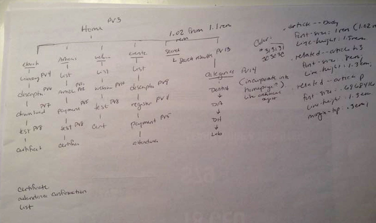
With this revelation out in the open it was time to proceed with an overhaul of the entire website system and take a deep look into the relation of each of the type of pages and their relation to other pages on the site. After this was completed I could figure out the different types of pages I needed and concentrate on how to make the experience on each of those pages as frictionless as possible.

With this new workflow and page breakdown I was able to prioritize the level of importance in which pages needed to be created to have the site still working, which pages could be revamped at a later date, and if some pages didn’t even need to be there. I realized that these were the question I should have been asking from the start. They shaped the design and development of the site and they greatly influenced the usability and user-satisfaction of the site. Being that this site was made for the user and they should want to keep coming back and wanting to use it. These changes and questions were crucial to start on the correct road and make a new design.